

Identity rebrand and design direction of NYC based experiential agency Factory360
I was brought as Design Director on to spearhead the rebrand of their identity into a multi-disciplinary, design-focused agency and re-establish their online platform. I led the UX study and UI execution of Factory’s branded design work and their designers, as well as helped Factory find a new development partner that could meet the ongoing needs as well as a new design approach.
Brand Identity
Strategy
IA / UX
Visual Identity System
Motion Design
UI Design
Art Direction
Design Thinking
Team Management
Production Design
Design Research
Web Development

Brand Identity,
Strategy, & Research

IA / UX
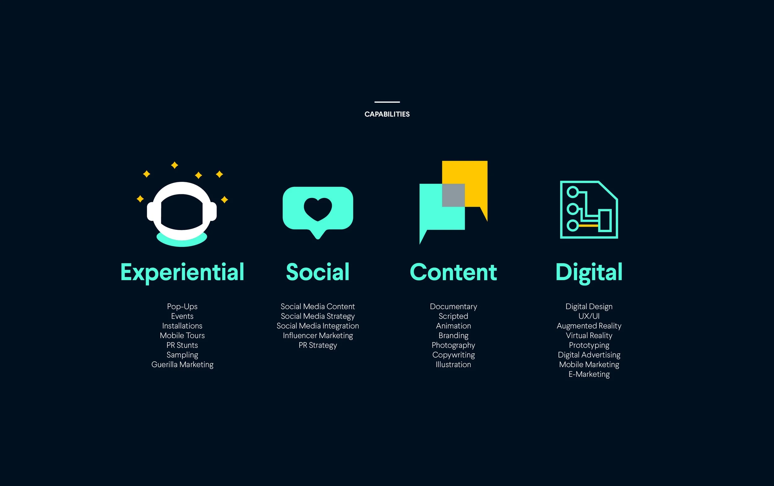
We broke down the main content of the existing Factory website to identify the key content that drives the agency’s SEO and designed a new journey that simplifies the user journey, making the new branding and strategic content accessible for future searches.
We went through several iterations of the site flow to ensure we have the simplest, most interesting way to make this information accessible as well as engaging.

Visual Identity System
We built a large wall of inspiration, taking into account design trends, both digital and analogue into a catalogue of ideas. We explored nuances in the agency’s name and identity to identify value in its cultural identity.
Next, we did an exploration of colour, typography, and an extensive exploration of the name and the F letterform—how can we represent it through various visual perception element studies from hand drawn sketches to digital iterations.


Exploration Process
Select refined digital Fs from the exploration
Logo
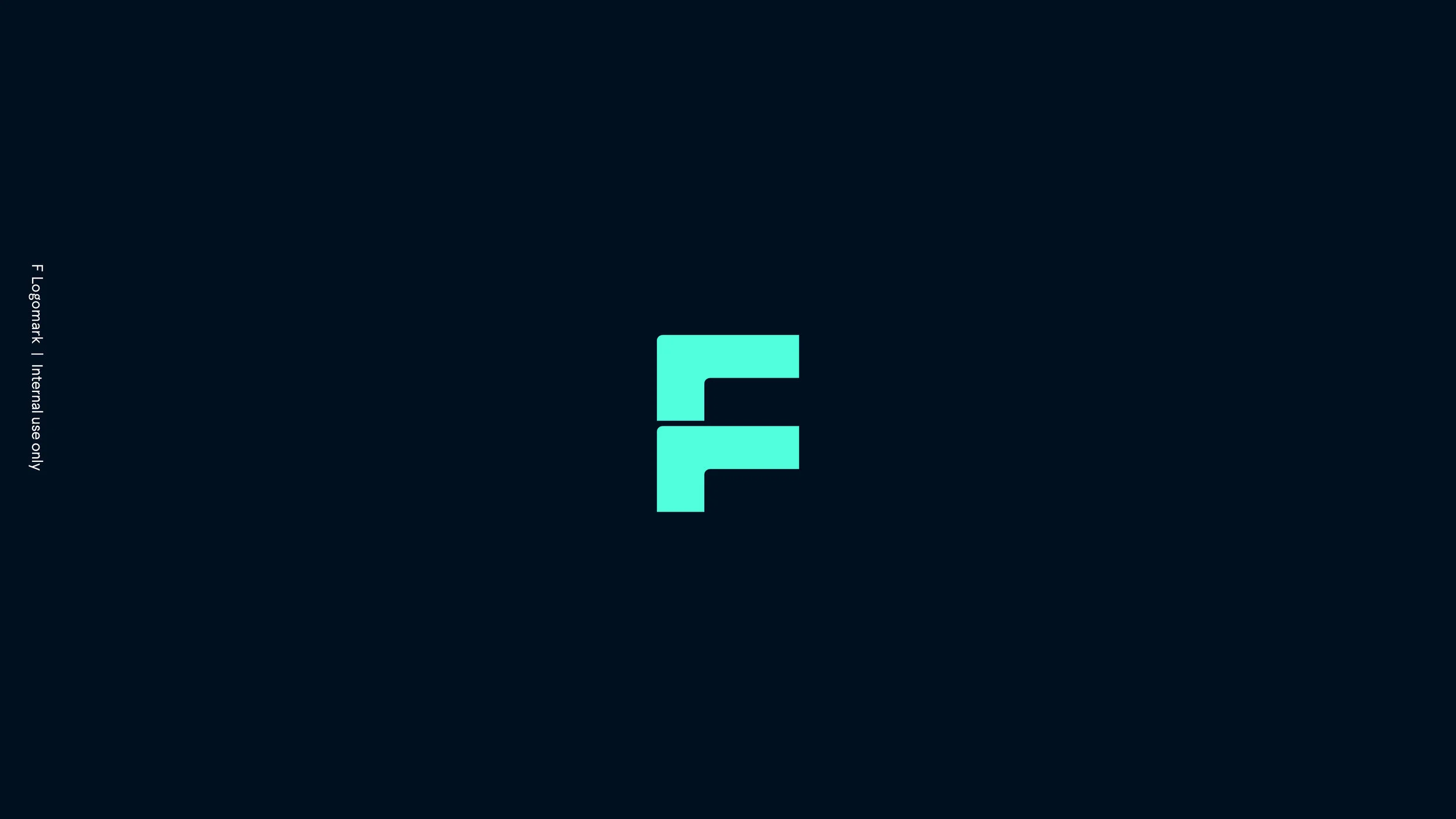
Simple geometric forms informed by the pillars and philosophy of the agency. As the symbol closely resembles a traditional F letterform, it is simply put, not the letter F but rather, a symbol made out of 1:1 geometric square units, combined into symmetrical proportions. The ‘dead middle center’ of its combination feels a little off—as horizontal shapes always feel heavier—because that’s just how our vision works.
Whenever the symbol is scaled to various sizes, from small to extra large, portions of the symbol require visual adjustments. This informed us to make the micro decision to round off the sharp corners of the brackets where horizontal and vertical lines intersect to soften the effect and print more accurately. The corner radius curves at 1/8th the size of the individual sq/unit.
Final Letterform Symbol
Official use — social profile images and presentations

F Symbol Anatomy Detail
Micro decisions in the brackets

A modern update
Wordmark
Limited Use — stationery and web

We made sure the points are….on point.

Colour Palette
We chose a midnight blue and neon green pairing as it was the natural evolution of the agency’s identity towards a modern take, and that we liked the idea of a unique digital identity, where only with the right pantone chip, will you recognise the brand—and is not easily imitated by a xerox reproduction. Secondary colours include a gold and grey.

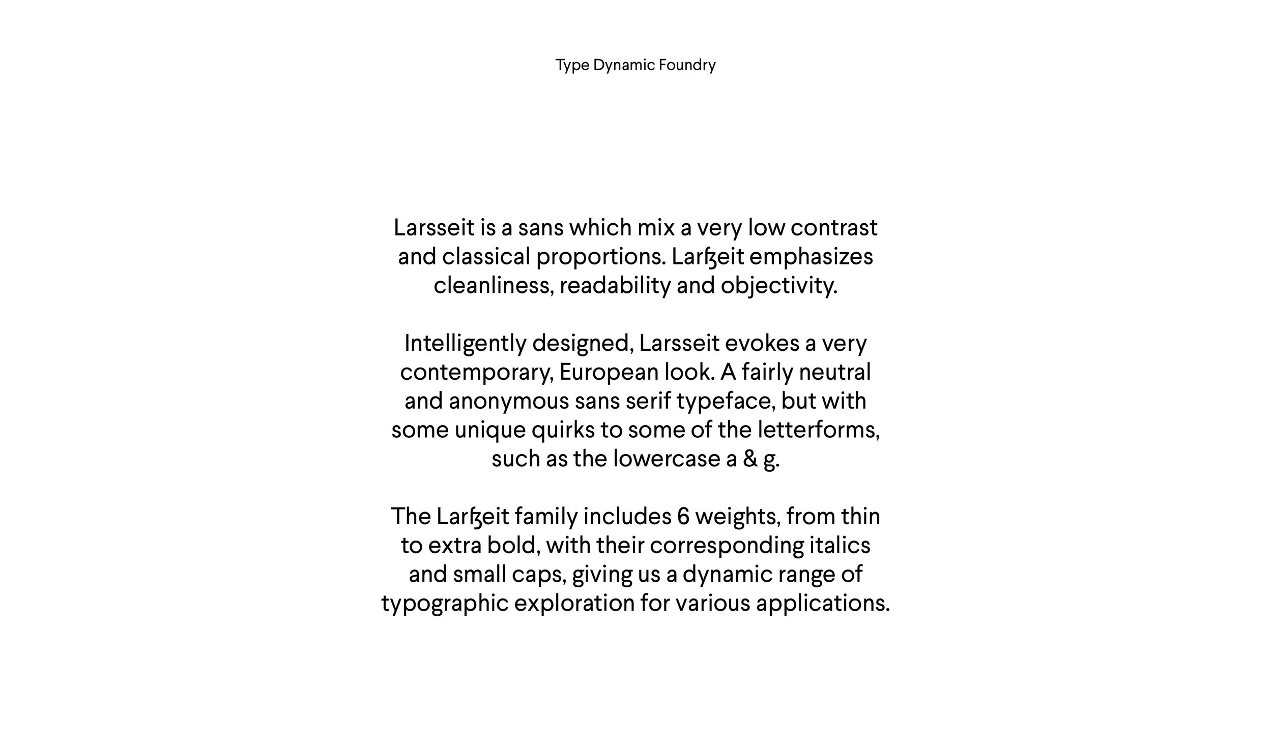
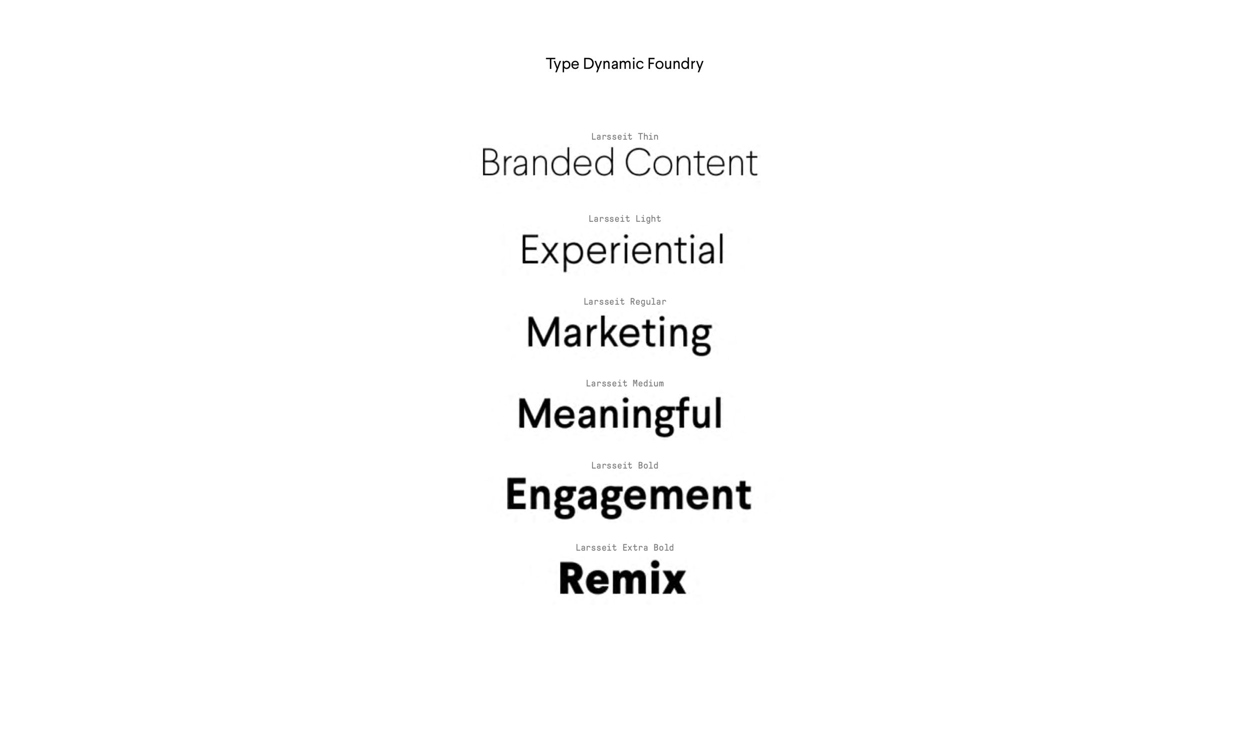
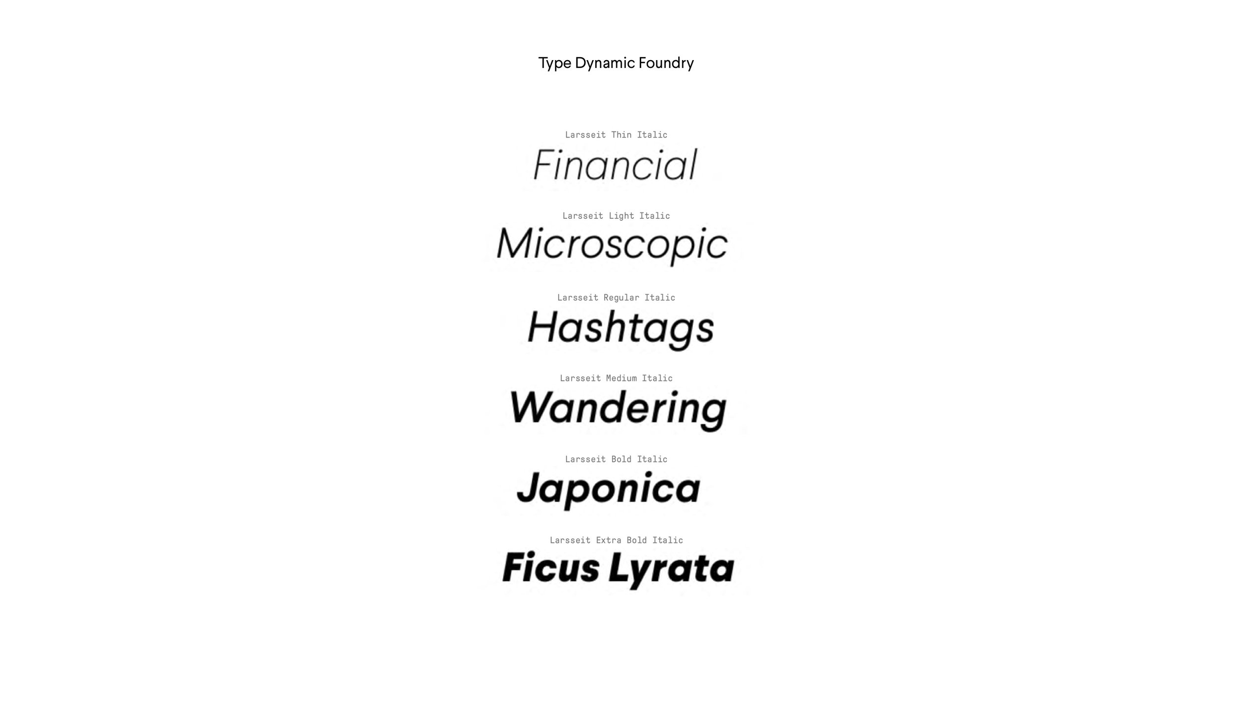
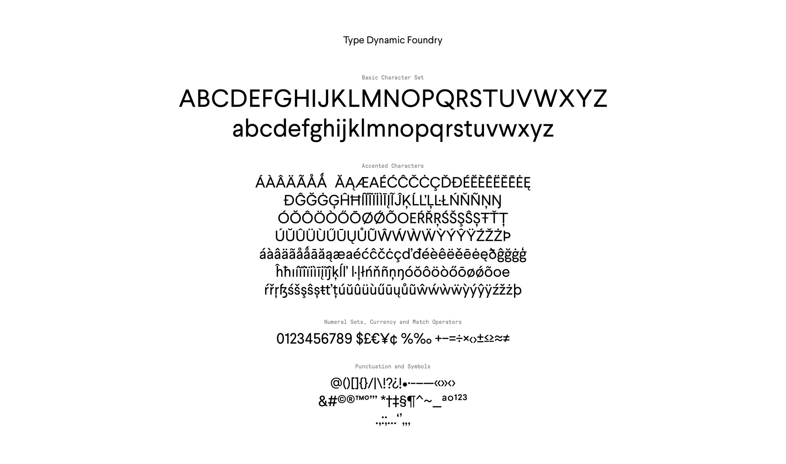
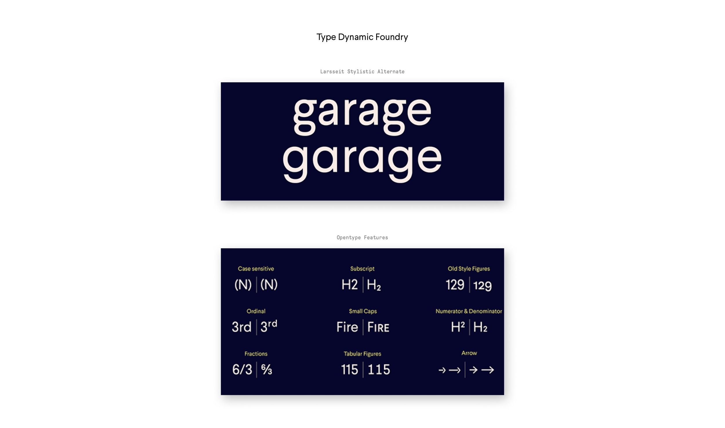
Typography
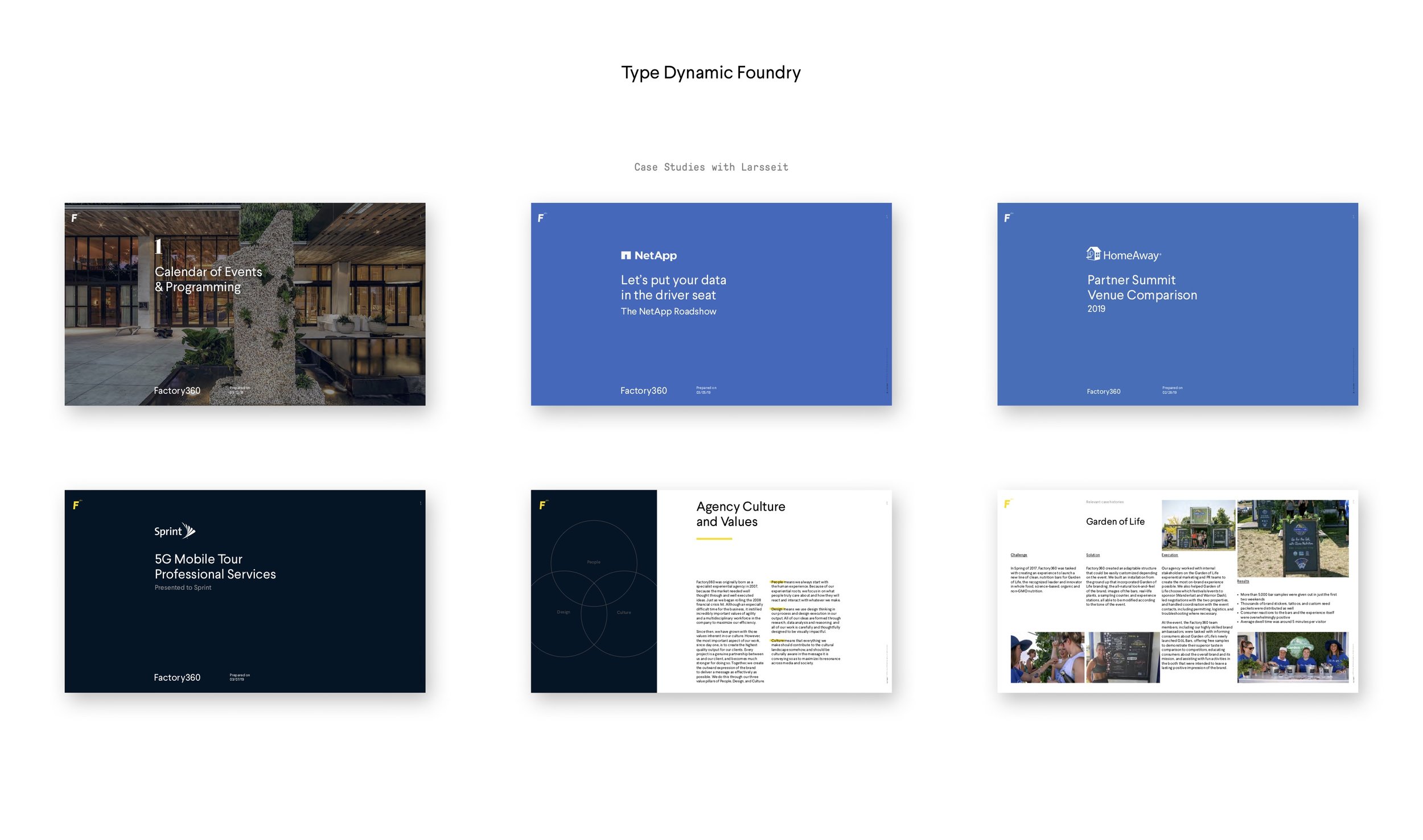
After an extensive study on various typographic families, weight variation, individual characteristics, and contemporary relevance, we concluded our selection with the typeface Larsseit, by Type Dynamic Foundry.

Icon Graphic System
I designed and illustrated a comprehensive library of icon designs in the same graphic style.

Motion Design
With the structural visual elements identified, we explored using basic geometric shapes. I created an animated video showcasing the branding and strategy via a fun but simple 2D motion graphic that narrates the various taglines from the rebrand.
This video only plays once upon first time entry to the website.

UI & Website Design
We created several versions of the site with my team, and I’ve narrowed down the creative direction to this responsive type layout that pushes the dynamic flexibility of our chosen typeface. We found that the type can get really playful at small to large scales and went with it. I built the site prototype and page-by-page UI designs on Sketch and Illustrator, animated on After Effects. The working files and video mockup was tagged with functional requirements to pass along to our developers which sped up our dev process.

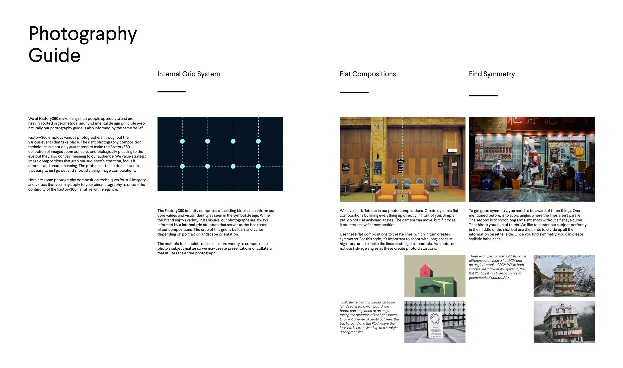
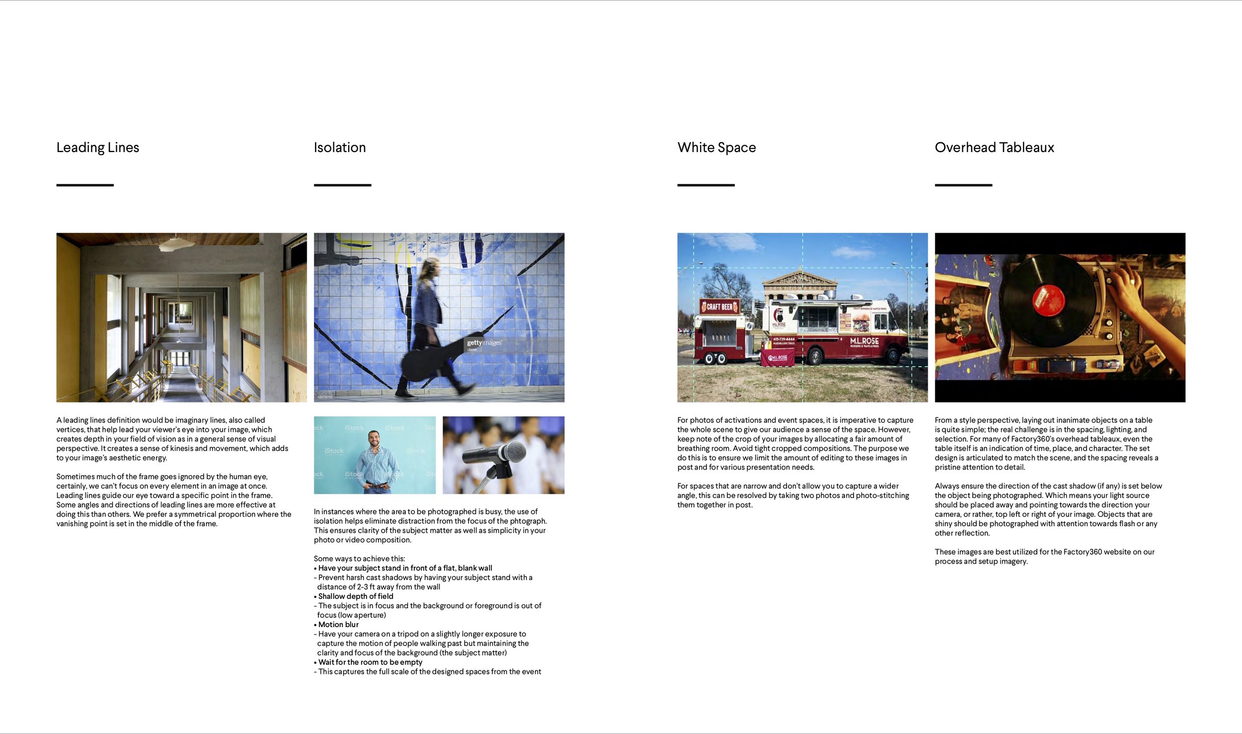
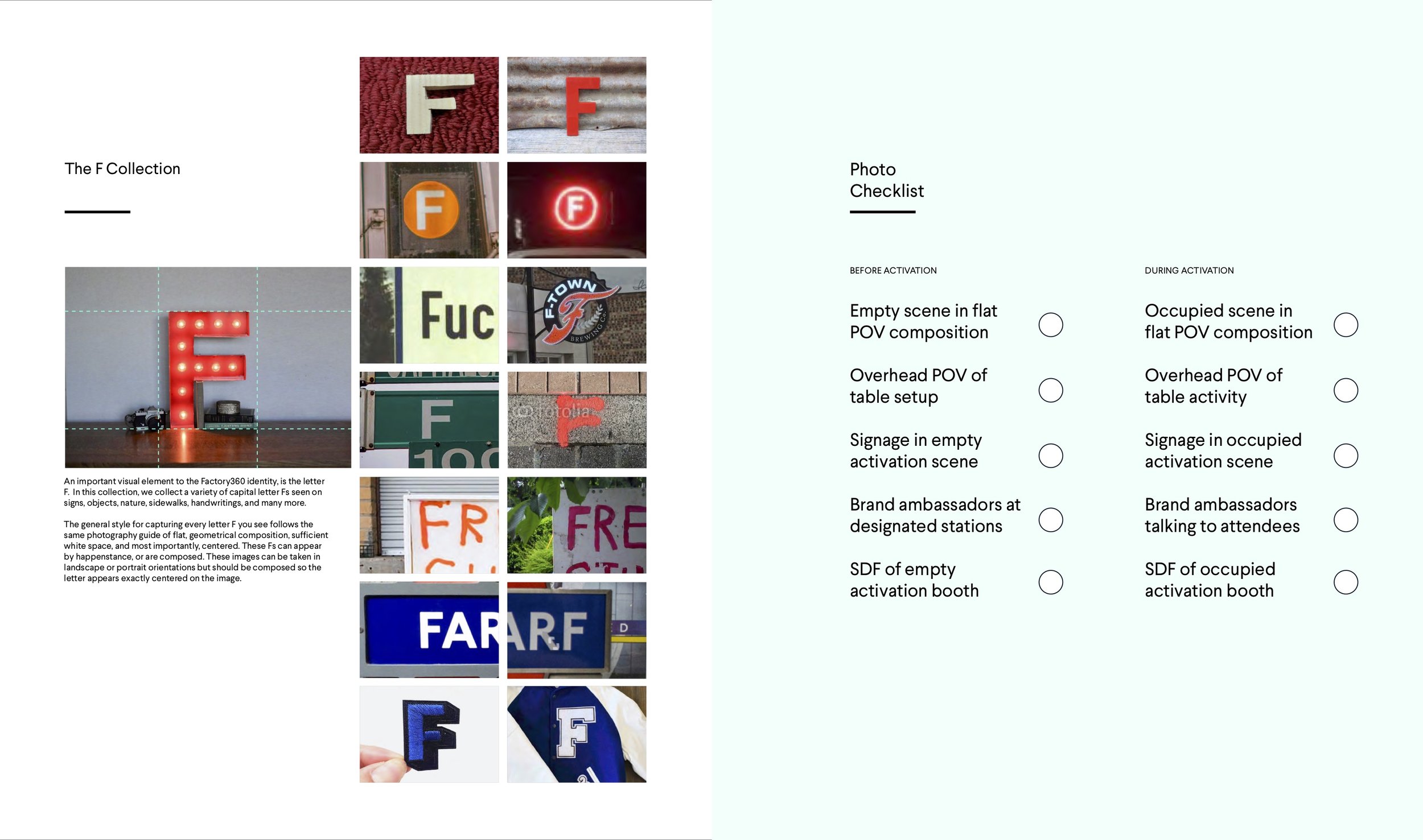
Photography Art Direction
To tie the whole new branding together, I’ve developed a photography guide of stylised art direction to incorporate the visual cues of the rebrand. Translating basic, geometrical visual cues into photography meant a clear observation in flat, symmetrical compositions, use of white space and grids, and of course, overhead tableaux shots.
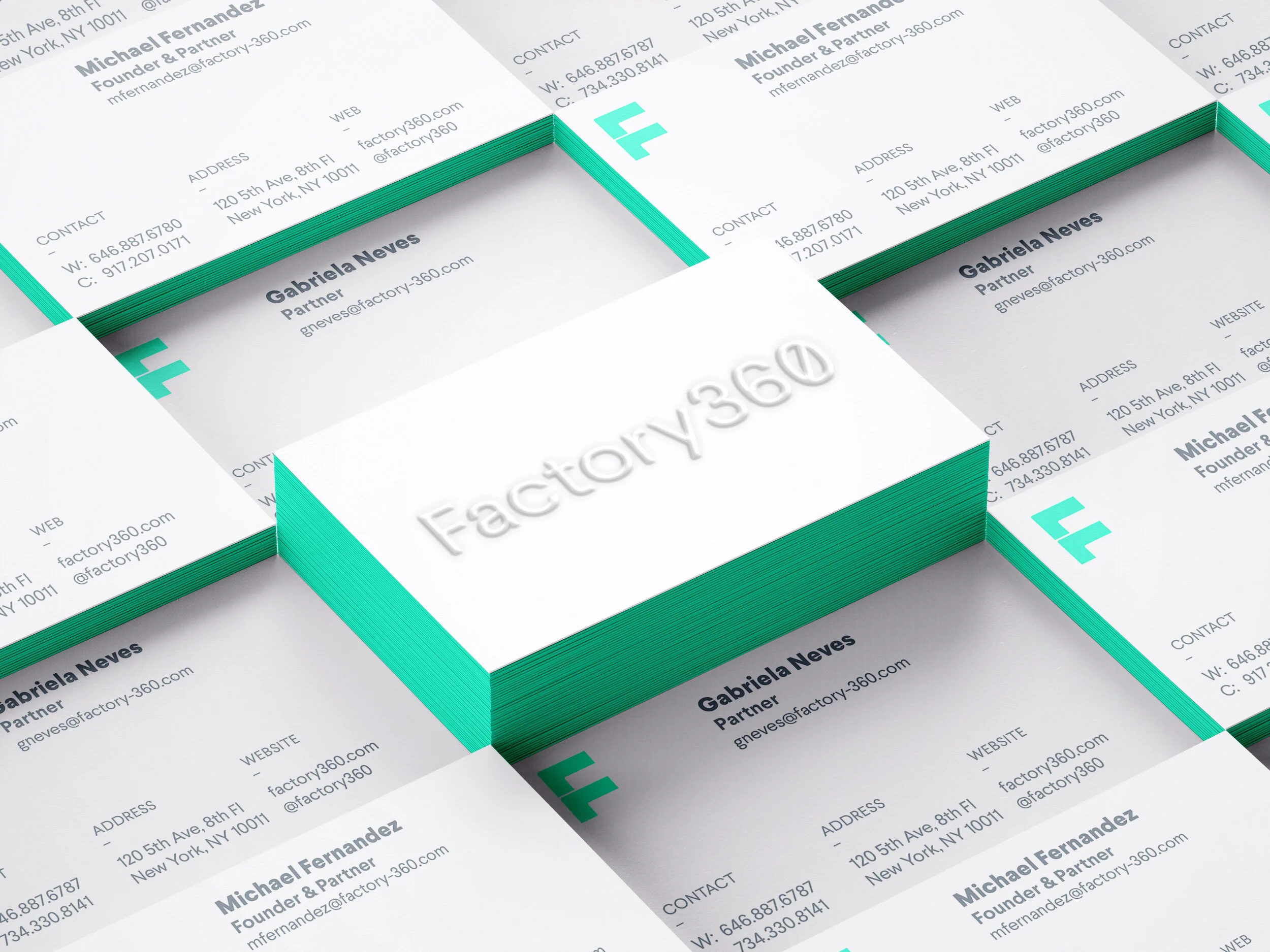
Production Design
Additionally, we created a range of agency merch and swag bag content for staff, clients, and interns.


Illustration
Illustrated neighbourhood guide A6 fold over card of the F360’s Union Square area for new hires and interns, printed on 110# card stock.

